Your Guide to the Metropolitan Murals
It’s so uplifting to live in a community that continually celebrates and appreciates art and culture. Home to several murals, Metropolitan’s commitment to showcasing local talent is unparalleled.
It’s so uplifting to live in a community that continually celebrates and appreciates art and culture. Home to several murals, Metropolitan’s commitment to showcasing local talent is unparalleled.

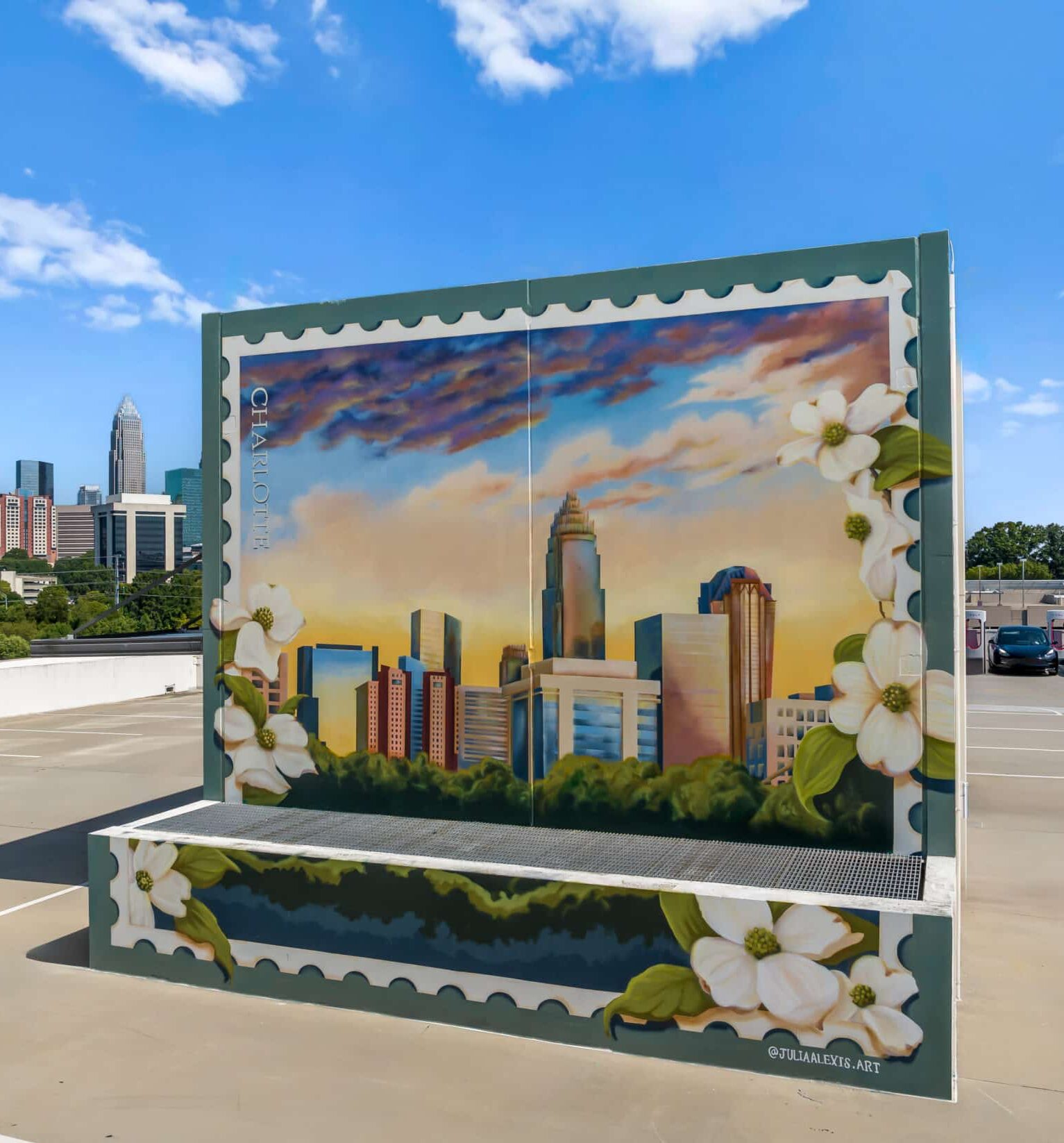
"A vibrant and iconic view from the top of the Metropolitan CLT parking deck, this mural captures an epic Carolina sky above the beloved Queen City—a scene worthy of a postcard. The dogwood borders, North Carolina’s state flower, anchor the mural in its local context."
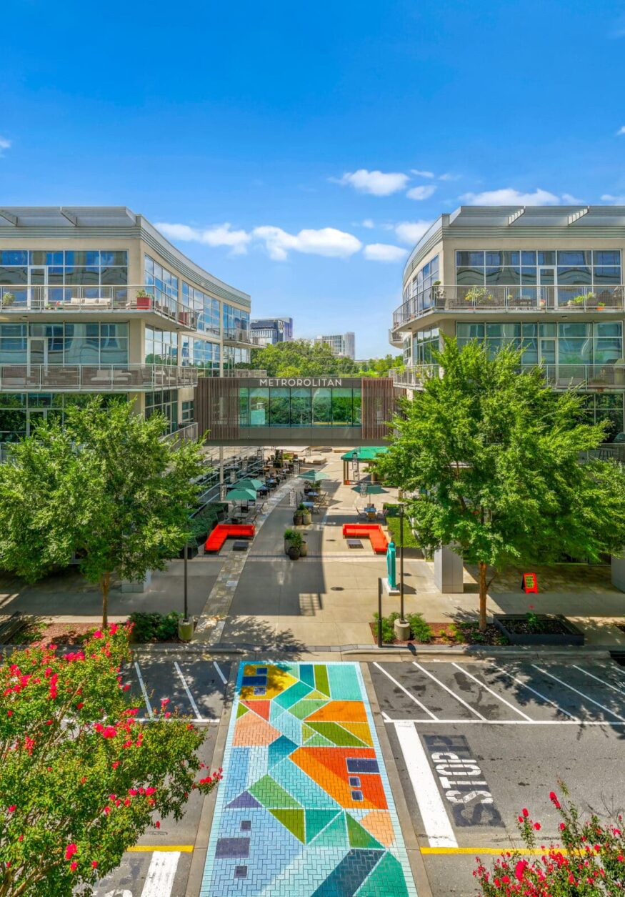
"This crosswalk mural embodies Metropolitan CLT at the intersection of city and nature. Inspired by the Metropolitan brand pattern and its bold, urban colors, the abstract design depicts city buildings and homes along the greenway, with Little Sugar Creek running through the center. From an aerial view, the composition is most prominent, but as you cross the creek on the ground, the greenway and surrounding landscape come alive."

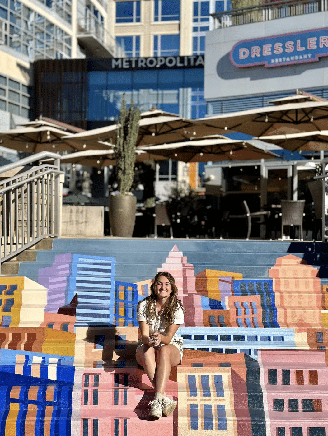
"This mural plays with perspective, best appreciated through a camera. Stand at the “window brick” to experience a unique view of Charlotte’s night skyline."
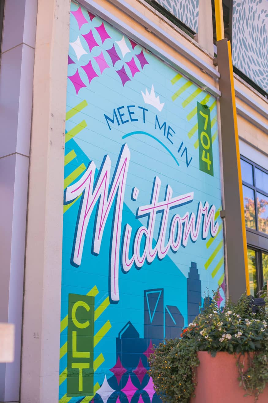
Meet me in Midtown was designed to reflect the vibrancy and history of the Midtown area. The bright color and the patterns sprinkled throughout represents the mixed-use nature of the community with its retail, residential, and office spaces. The typography was inspired by Mid-Century modern design - something prevalent during the era of the former Charlottetowne Mall that graced the same location.